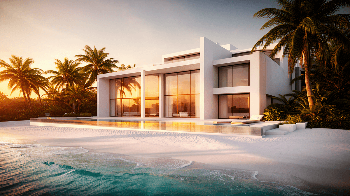
Visualization
AI Arch-Viz Prompting Notes
Practical notes on using AI image generation for early architectural visualization without overstating what it can replace.
The useful lane
AI architectural visualization is useful at the beginning of a project, when the team needs to explore tone, audience, lighting, camera language, and visual positioning. It can create fast visual references before a full 3D scene is worth building.
That is a narrow but valuable lane. It is not the same as final visualization. A generated image is not a BIM model, a measured plan, or a dependable construction reference. If exact geometry matters, the image model should not be treated as the source of truth.
The right expectation is concept direction. The output can help a client or designer decide whether a project should feel quiet, coastal, dense, premium, hospitality-focused, residential, or civic. It can start that conversation earlier than a traditional render pipeline would.
Prompt the camera before the mood
The strongest results came from prompts that described the camera before the emotional language. Lens length, camera height, time of day, light direction, weather, and framing gave the model concrete constraints. Broad words like luxury, cinematic, and premium were less useful by themselves.
For a beachfront residence, I would start with the property type, camera position, focal length, sun angle, and material palette. Only after that would I add atmosphere. If mood leads the prompt, the model often drifts toward generic resort imagery that looks polished but says little about the actual design direction.
This mirrors normal architectural photography. A low camera with a wide lens says something different from a compressed telephoto view. Blue hour suggests a different sales story than hard noon sun. The prompt should make those choices intentionally.
Watch for false polish
The main risk is false polish. AI images can look finished while hiding structural problems. Facades may repeat in impossible ways. Columns may not align. Windows may imply floor plates that do not exist. Interior views may ignore circulation, code, or basic spatial logic.
That does not make the images useless. It means they need labels and boundaries. I would present them as AI-assisted concept references, not as resolved architecture. The difference matters because clients can easily read visual polish as design certainty.
A good review pass should ask simple questions. Does the building make sense? Does the scale feel plausible? Do materials connect from one area to another? Is the camera selling an idea that the design can actually support later?
How I would use it in a real workflow
I would use this workflow to create a small set of visual territories. One direction might emphasize hospitality and warm evening light. Another might focus on clean residential calm. A third might test a denser urban or mixed-use read. Each territory would be clearly labeled as a concept study.
After that, the team should choose a direction and rebuild it with controlled geometry, real references, and a normal visualization pipeline. That step is where design accuracy enters. The AI image helps identify the target. It does not replace the work needed to hit the target correctly.
Used honestly, this can save time. Used carelessly, it can create confusion. The difference is whether the image is treated as a sketch with strong rendering quality or as a finished design artifact.
What I would test next
The next useful test is consistency. One good image is easy to admire. A useful workflow needs a sequence: exterior, lobby, amenity, room, aerial, and detail views that feel like the same project. That is harder.
I would also test handoff. If a generated concept is selected, how cleanly can it be translated into a modeled scene, a mood board, or a client deck? That handoff determines whether the workflow is practical or just visually interesting.